After initially diving into a google rabbit hole in Typography, the answer to what font to use for our puzzle box was super simple. Let’s use the font that the National Gallery of Australia uses!
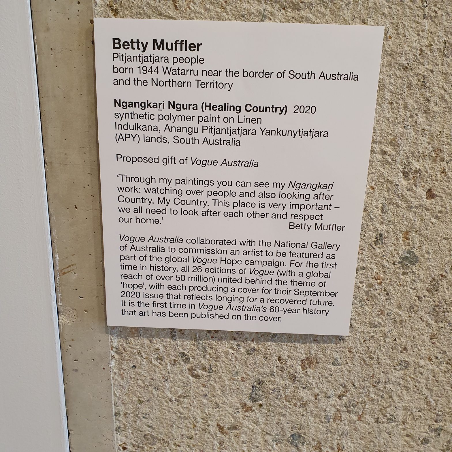
I went over with my camera and took many photos of the signage at the gallery.
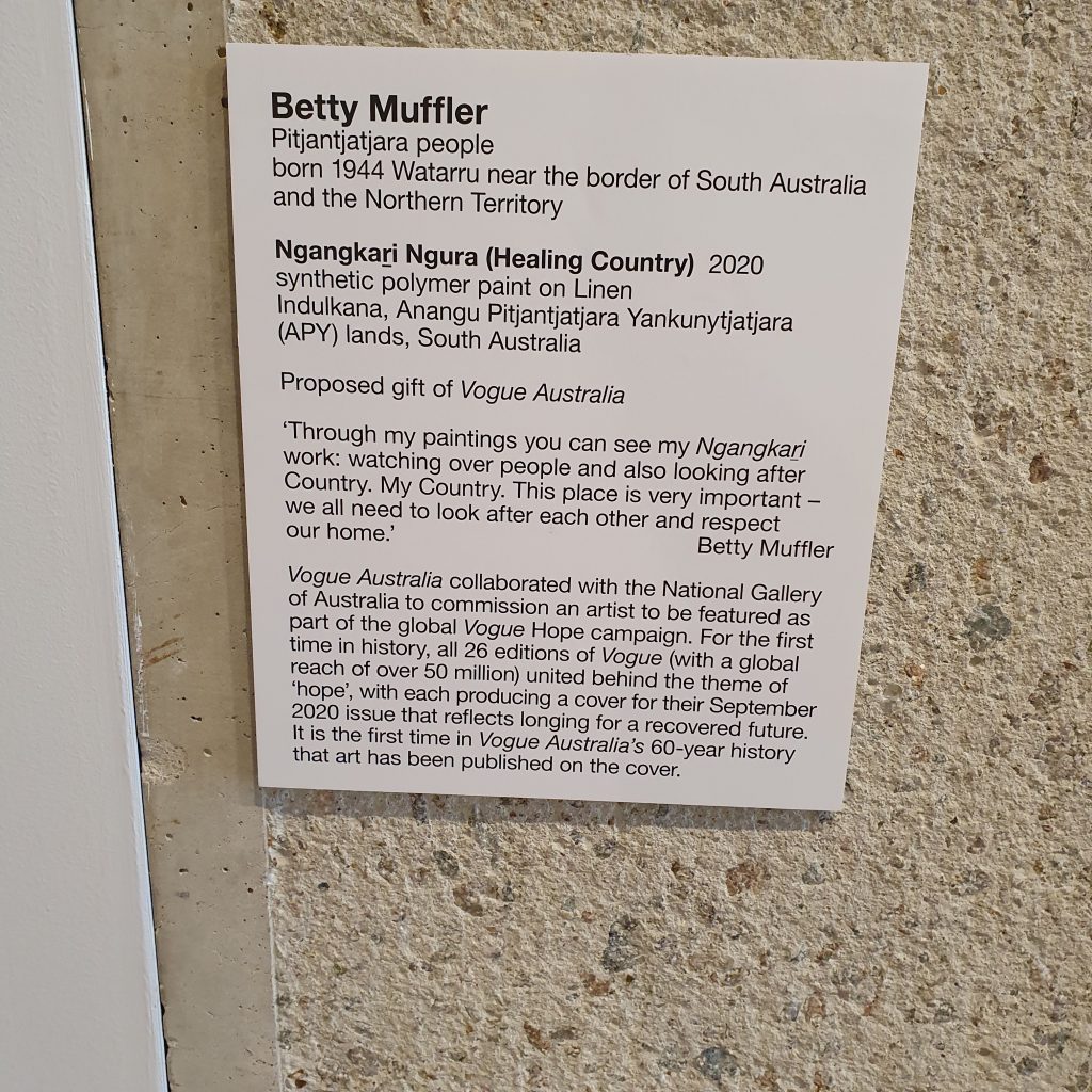
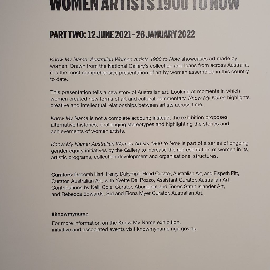
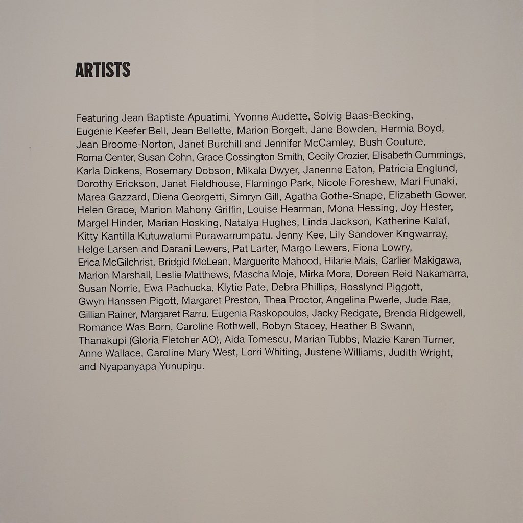
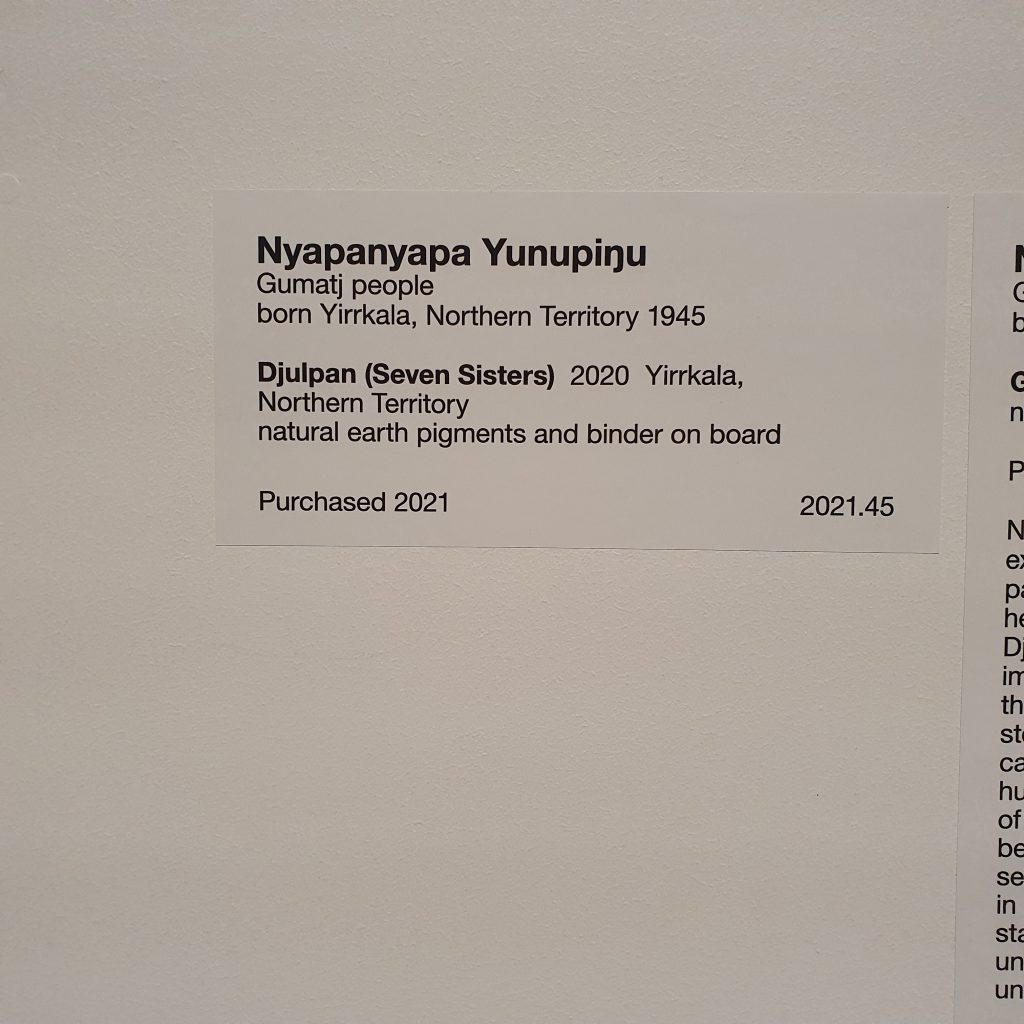

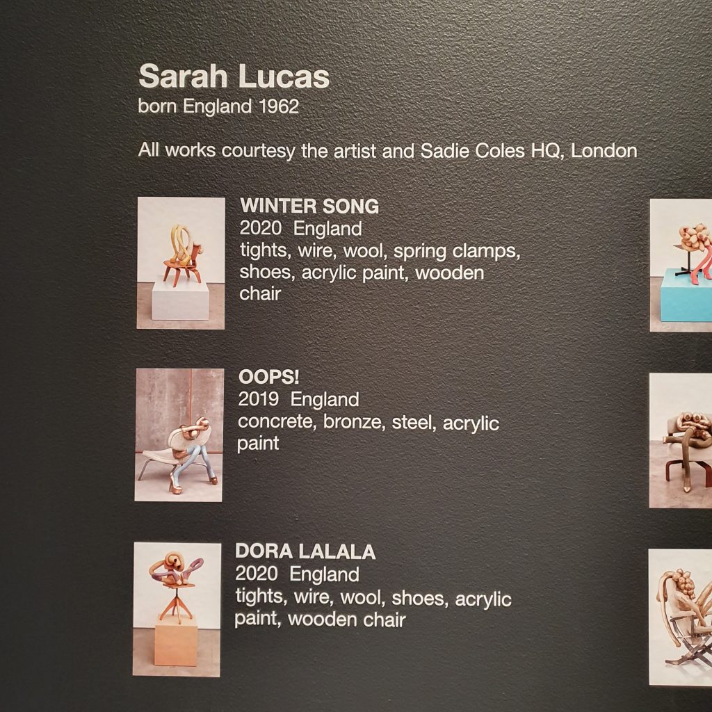
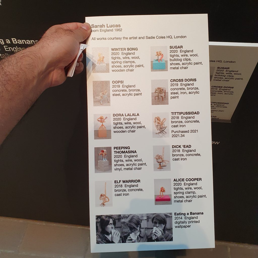
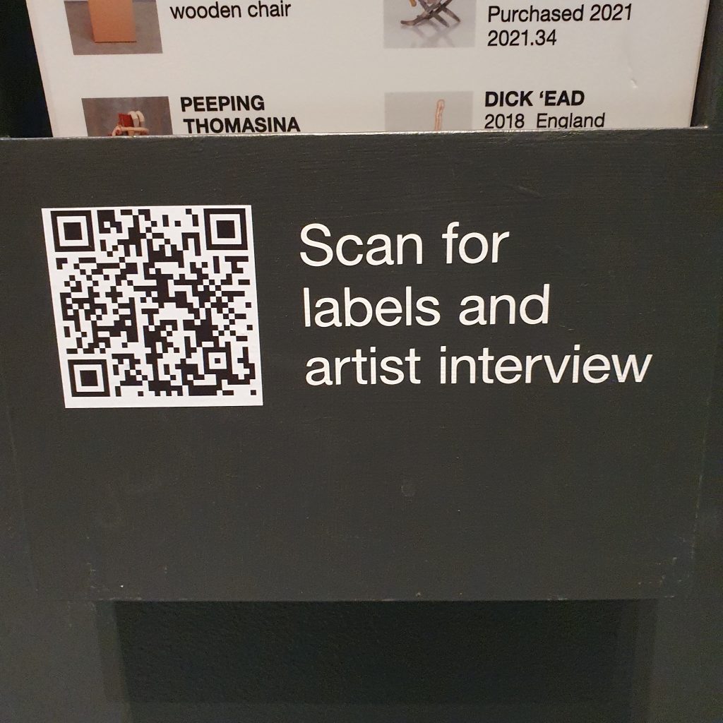
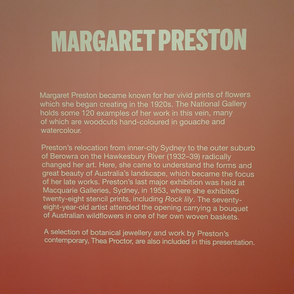
When I got back home and tried to identify the font using reverse image search or font websites identification software, they never got the right thing. I don’t know why that was. Maybe the software struggled with the angles of the photos or maybe they wanted to promote the fonts they were selling. But either way Helvetica was not one of the options that was popping up.
So I started manually comparing the font to all the ones installed on my computer one by one… and Arial was a close match! But not quite. I thought surely there is an easy way. I then remembered a design friend who use to be able to identify fonts by sight. And then hey another thought “Why don’t I ask one of my friends who actually use to work at the National Gallery of Australia?”. A quick messenger chat later we had identified the font as Helvetica!
Thank you for reading this design diary, and in future installments looking forward to sharing with you some of reasonings behind the other design choices we made such as the making of the logo, choosing the artworks, box design, etc.
